Background
APIX is a platform that connects financial institutions, fintech companies, and developers through hackathons and events.
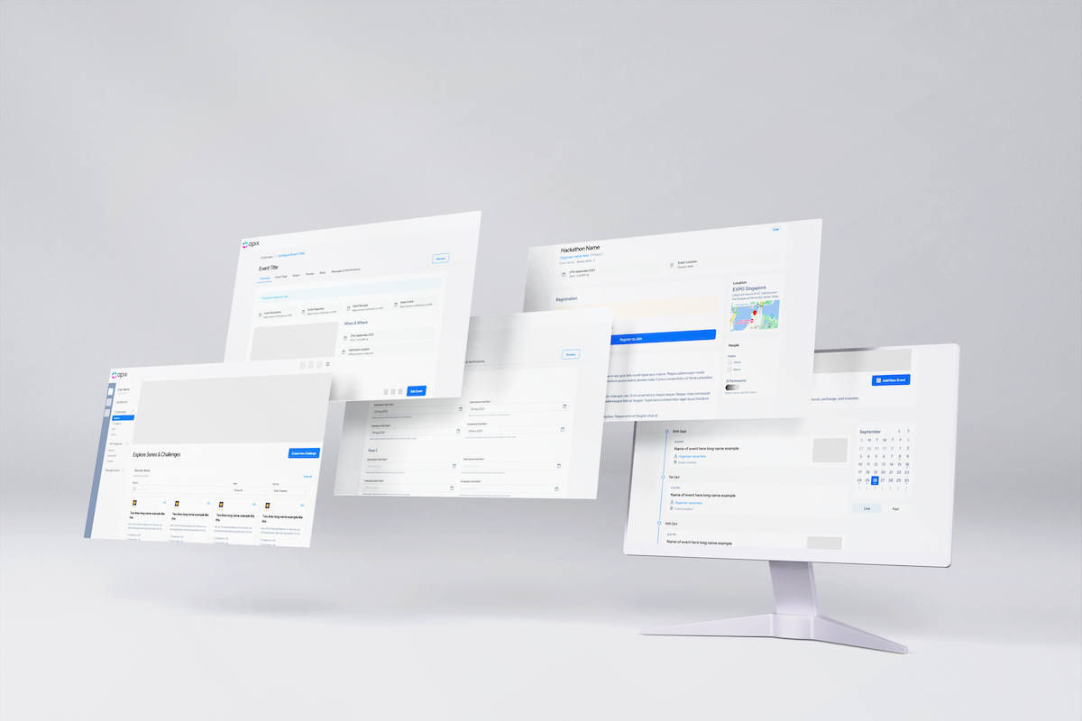
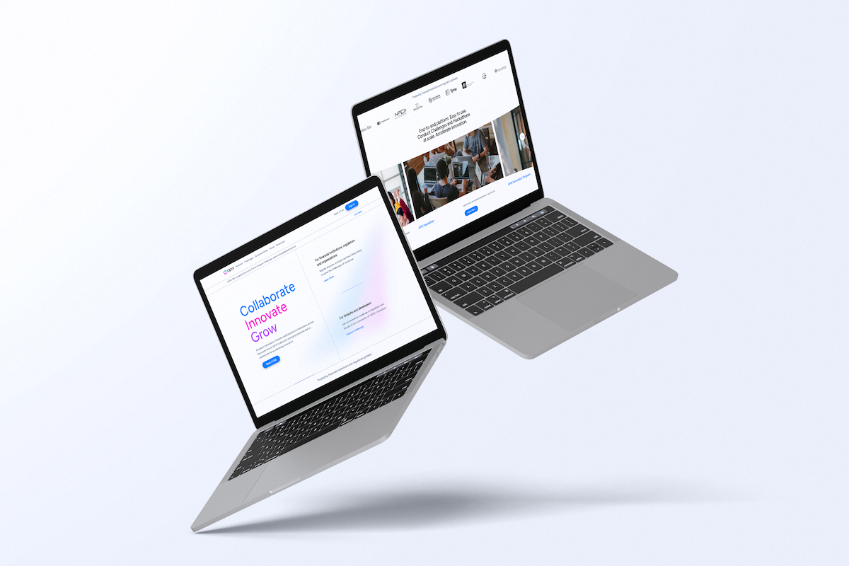
With a brand facelift recently implemented, I was engaged as a freelance product designer to revamp the user experience and user interface of their web application.
Roles
While the platform was live, there were areas for improvement in the user experience.
We assumed the following roles:
- User Experience (UX) Researcher
- UX Designer
- Interaction (IxD) Designer
- User Interface (UI) Designer
Deliverables
UX/UI Design:
- Competitive analysis
- Personas
- User journeys and task flows
- Low-fidelity wireframes
- High-fidelity mockups and prototypes
Project Specifications
Duration: 3 months
Tools:
- Figma
Problems
After the initial UX audit, it was clear that there were some usability issues. While the functionalities were there, the design was dated, making the user experience clunky and unprofessional. Here were the key concerns:
- Confusing user journey and navigation
- Hackathon features were not obvious
- New brand guidelines have yet to be implemented
- Joining hackathons and tracking hosted hackathons was difficult
- Lack of clear use cases, user roles, and permissions
Solutions
After identifying the key problems, the goals for the project became clear:
- Introduce a cleaner information architecture.
- Conduct extensive research into the different target users of the web app
- Introduce an improved design for the hackathon features
- Redesign the entire web app to follow the new brand guideline specifications.
Research
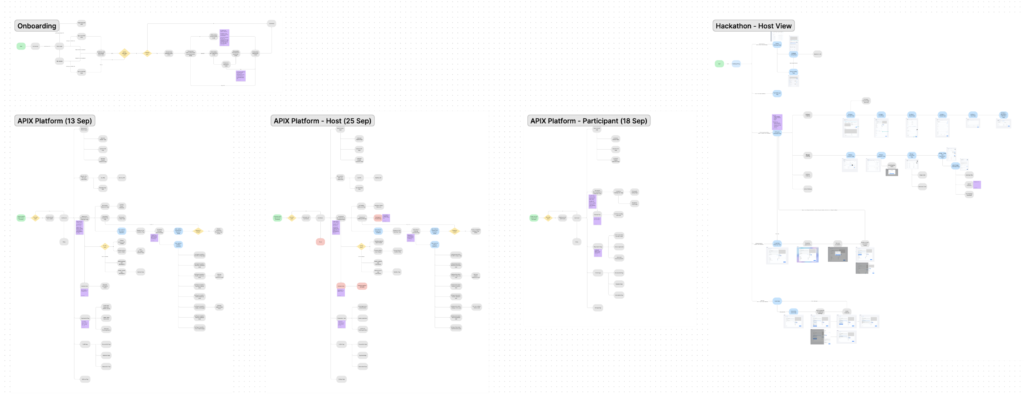
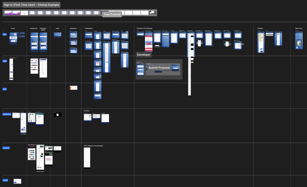
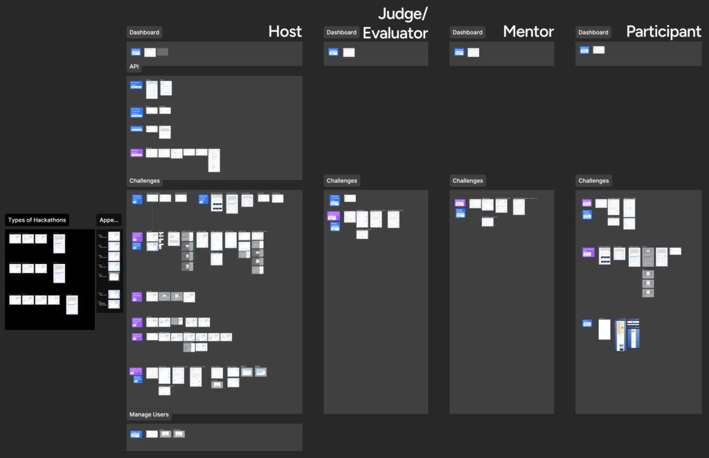
Since APIX already had an existing website, we spent some time examining the user flow diagrams and seeing areas for improvement – from calls-to-action (CTA) to information architecture. I did this using Figjam.
Following that, I took notes from client meetings and took time to compile the core features required in the web application. I wanted to ensure that the web application was seamless and clear for the users.
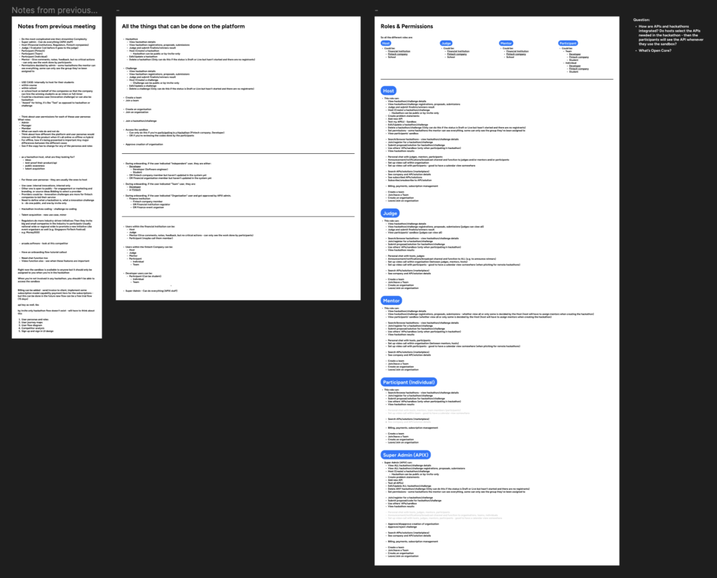
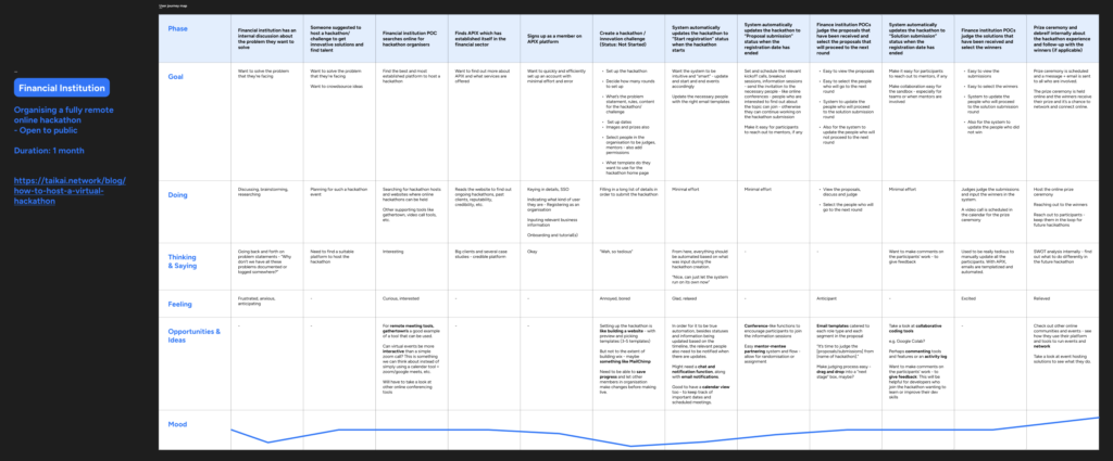
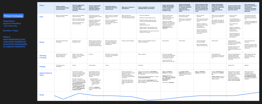
Based on the roles and permissions, I crafted the key user personas. Three key types of users emerged: Financial institutions, Fintech companies, and Developers. They have been color-coded blue, purple, and green respectively.

I also came up with user journey maps for each type of user to identify potential pain points, pitfalls, and opportunities. I broke down each phase of the user journey and identified multiple opportunities to improve the user experience such as:
- “For remote meeting tools, gathertown’s a good example of a tool that can be used. Can virtual events be more interactive than a simple Zoom call? This is something we can think about instead of simply using a calendar tool + Zoom/Google Meet, etc.”
- “Setting up the hackathon is like building a website – with preview and picking templates (3-5 templates) But not to the extent of building like on Wix – maybe something like MailChimp. Need to be able to save progress and let other members in the organization make changes before making it live.”
- “For it to be true automation, besides statuses and information being updated based on the timeline, the relevant people also need to be notified when there are updates. Might need a chat and notification function, along with email notifications. Good to have a calendar view too – to keep track of important dates and scheduled meetings.”
- “Conference-like functions to encourage participants to join the information sessions. Easy mentor-mentee partnering system and flow – allow for randomization or manual assignment“
- “Take a look at collaborative coding tools e.g. Google Colab. Perhaps commenting tools and features or an activity log. Want to make comments on the participants’ work – to give feedback: This will be helpful for developers who join the hackathon wanting to learn or improve their dev skills
- “Perhaps commenting tools and features or an activity log. Version control and ways to revert to a previous version might be useful”
- “Maybe some sort of countdown to be shown as well – when down to the last 24 hours before a submission. Can show on a side panel“
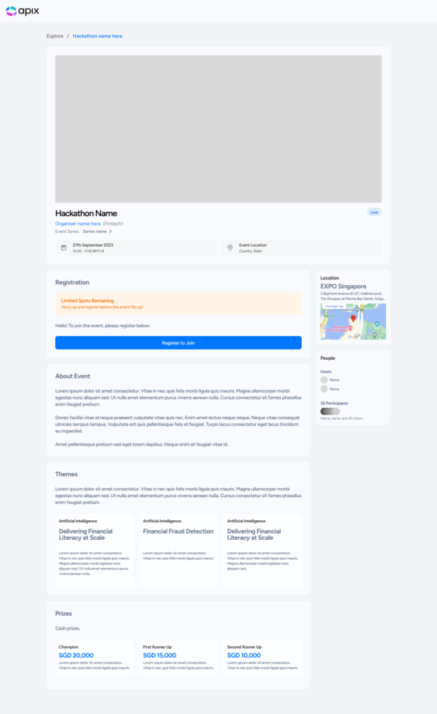
- “Hackathons have to make it clear what type of hackathon it is – details must be clear e.g. online/physical, duration, etc.”
- “There are a few scenarios: Individual hackathon, Team hackathon, No team yet, Have team members already. Need to make it easy to form a team – have some online community space where it’s easy to find and form a team – like a hackathon participants lobby page – this page can also be used to showcase: Proposals when it’s in judging period, Submissions when it’s in judging period, the ranking (if any) for the winners”
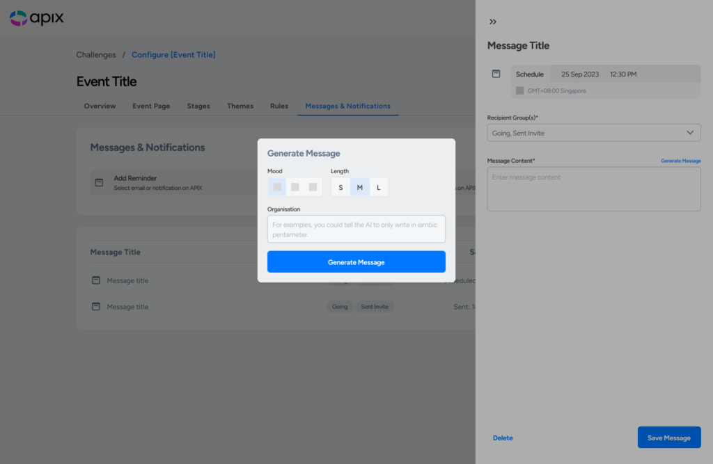
- “Use of AI for general descriptions”

As part of my research, I also did competitor analysis to understand how other products are addressing similar issues. The result was a comprehensive table with detailed comments on various features to take inspiration from or avoid.
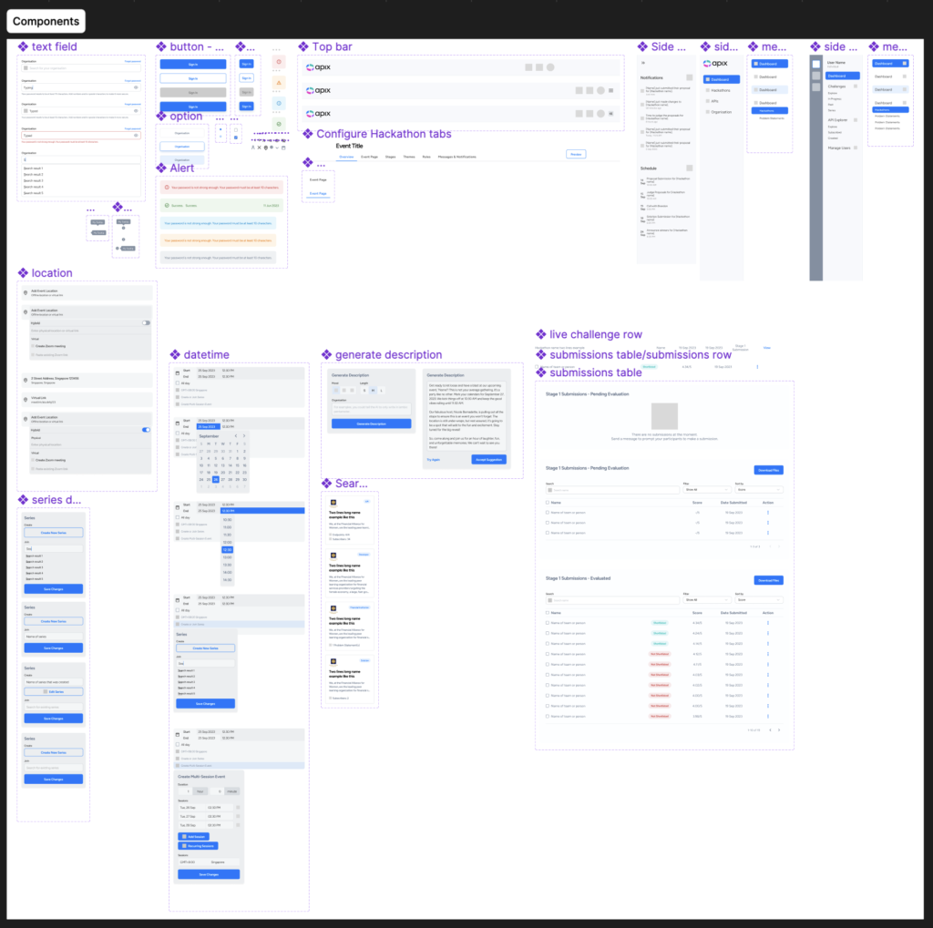
Figma Prototype & Design System
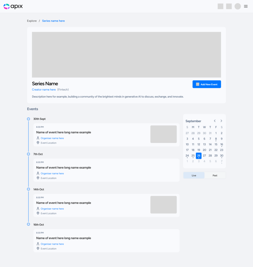
With the tight timeline and brand guidelines prepared, I went straight to high-fidelity prototyping in Figma. To ensure scalable and efficient design, I organized a simple design system and placed all components in a separate section within the file.
I began designing the screens based on the user flow diagrams in the research phase. The diagram helped make sure I didn’t miss any important features and flows. The UI design process involved check-ins with the client to ensure that I was going in the right direction.

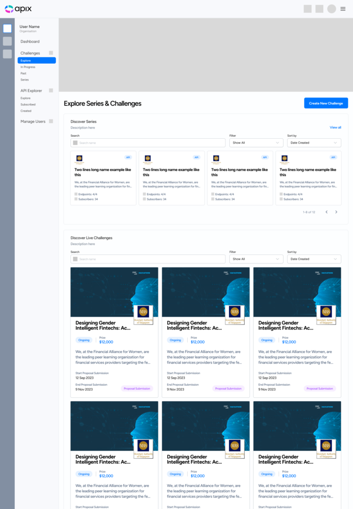
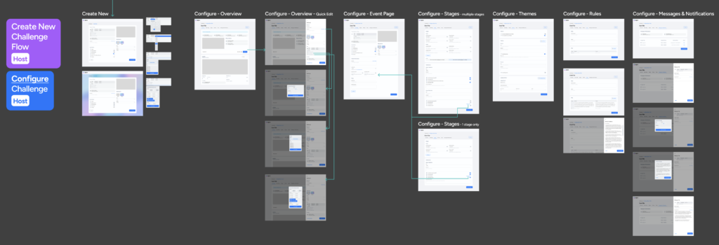
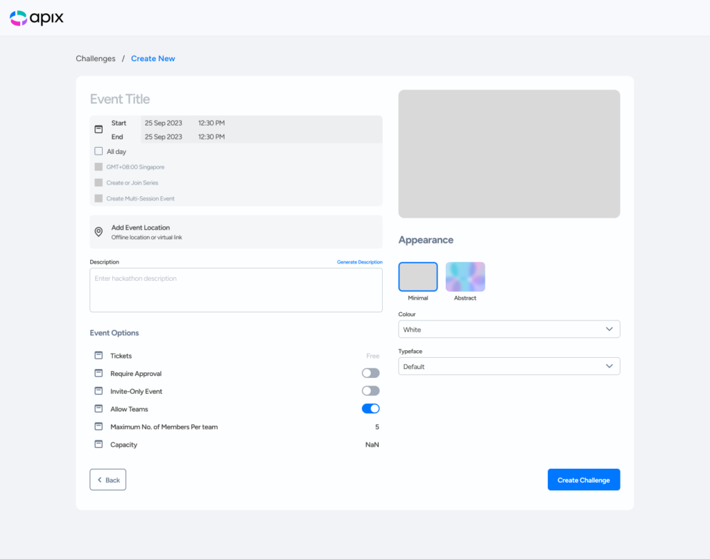
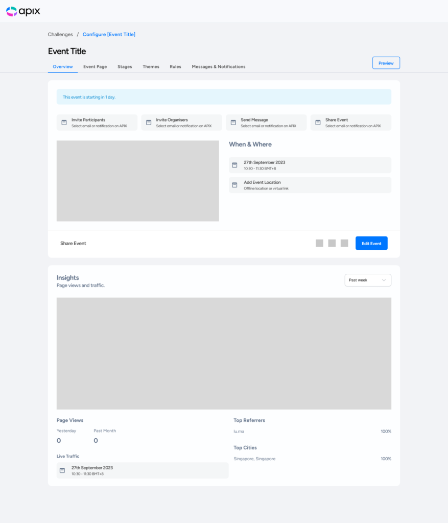
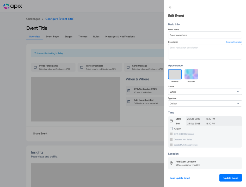
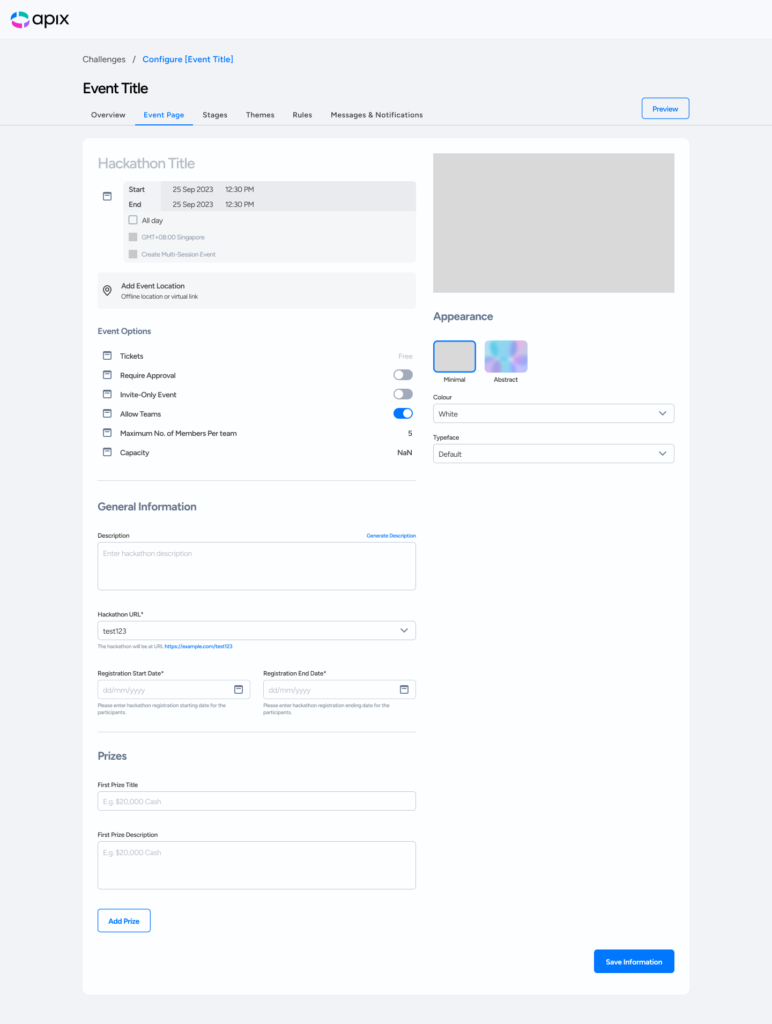
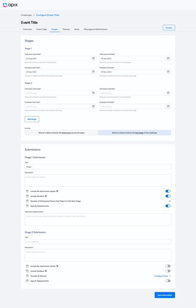
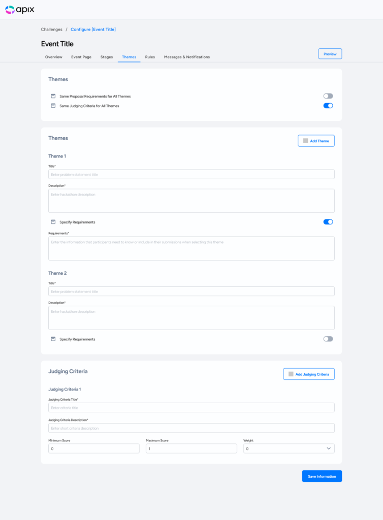
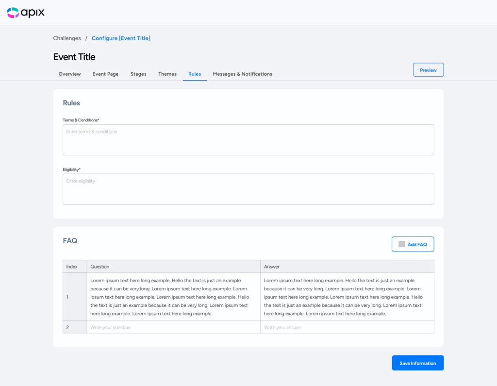
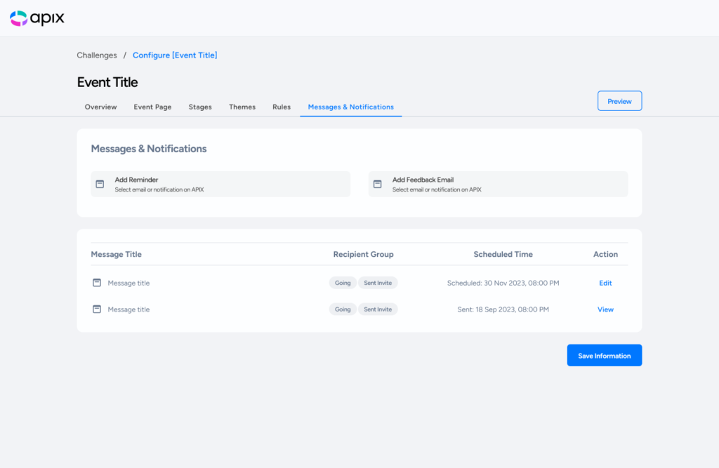
Create New Challenge/Configure Challenge Flow
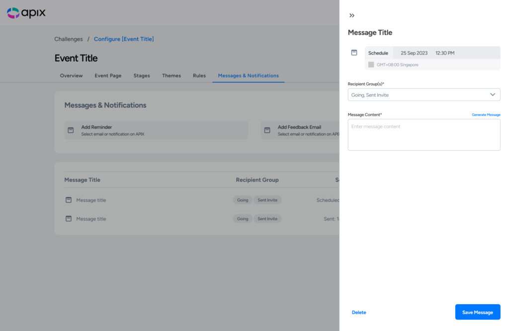
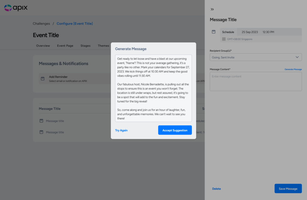
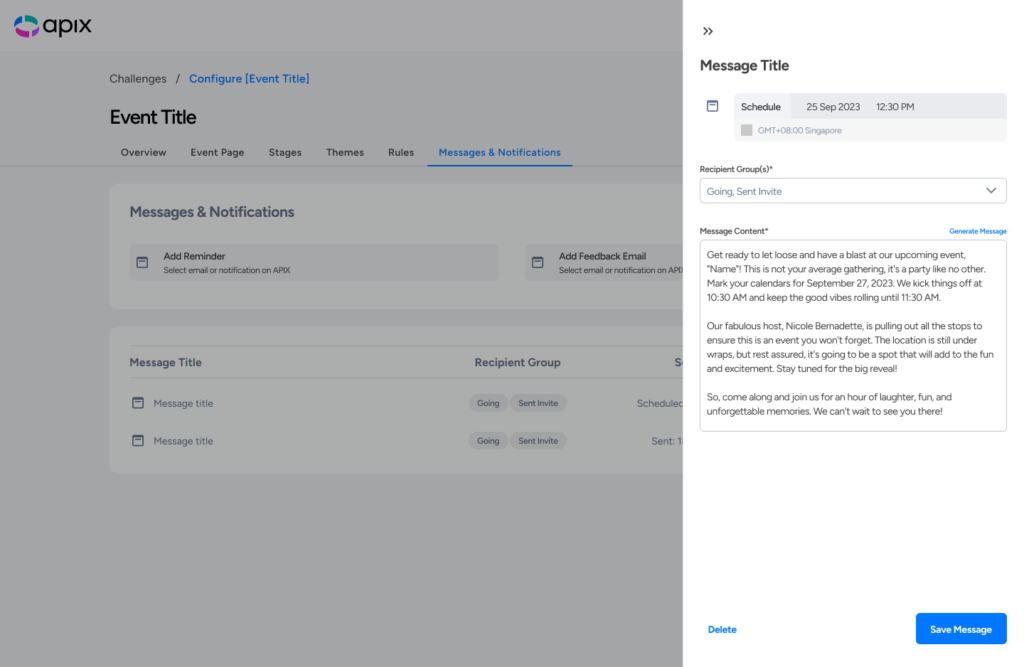
Configure Message/AI Message Generation Flow
Conclusion
I ended the project with a successful delivery of the UI/UX design Figma file from 0 to 1. I’m thankful to Synfindo/APIX Platform and Creatives At Work for this chance to be engaged as a freelance designer to lead the project from end to end.
